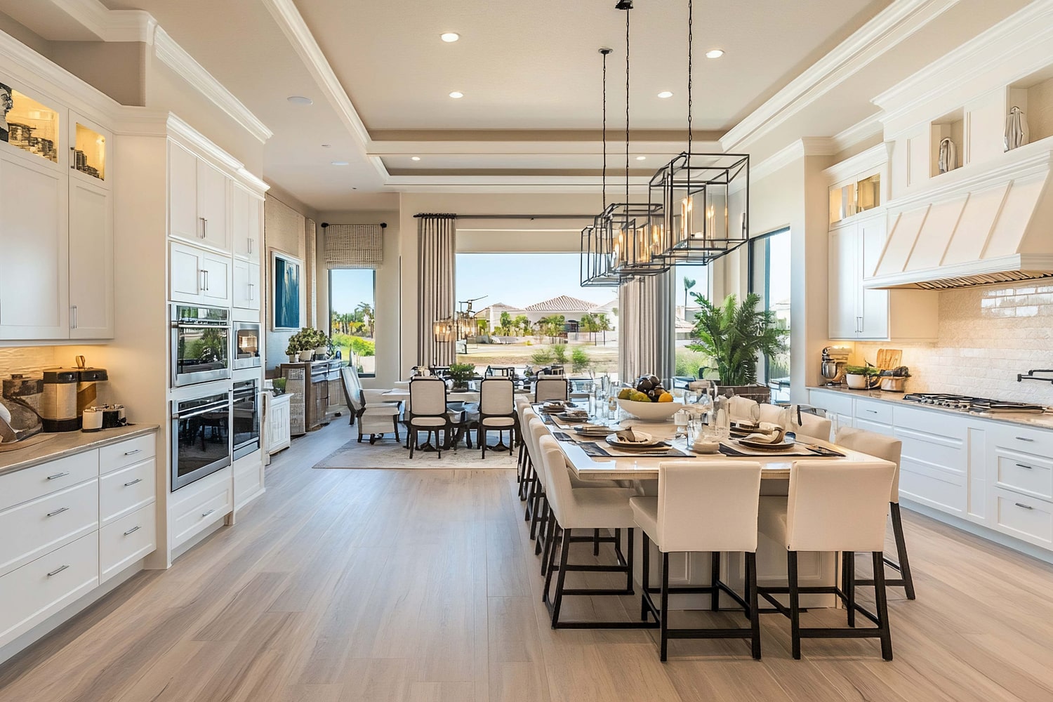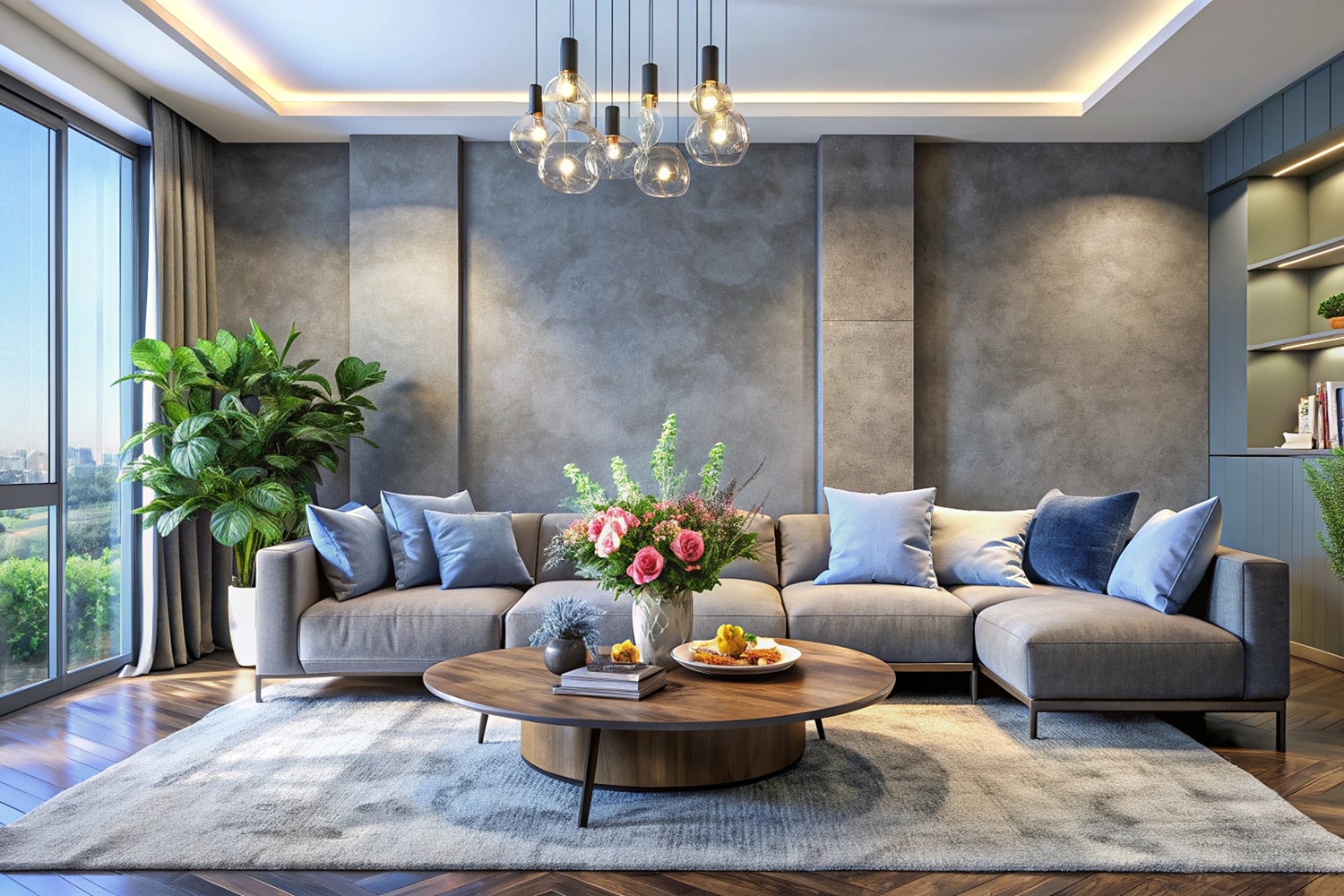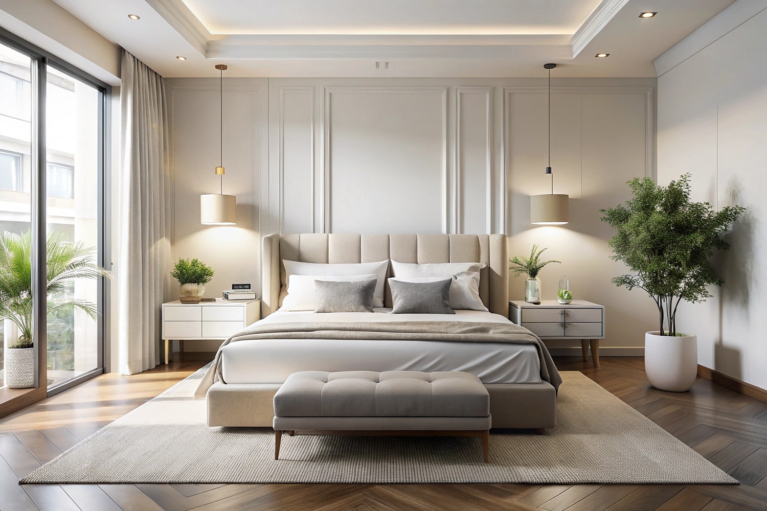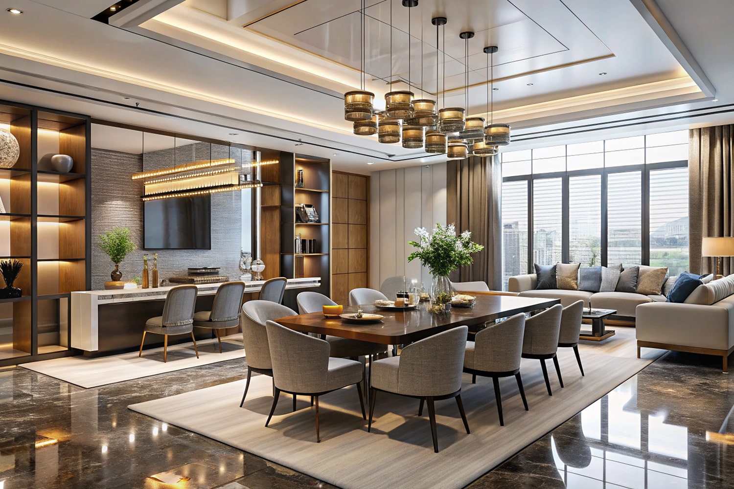
Timeless Design Principles That Elevate Any Space

Timeless Design Principles That Elevate Any Space

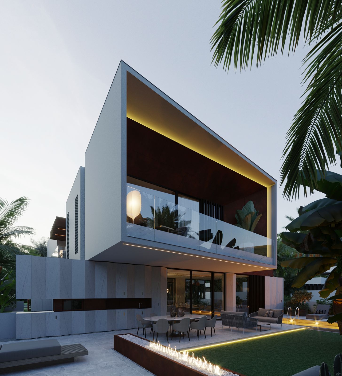
Discover how to blend art, architecture, and functionality to create spaces that are not just lived in, but deeply felt. Our approach to design merges precision with passion, creating environments where every element serves both aesthetic and practical purposes. Learn the fundamental principles that transform ordinary rooms into extraordinary experiences.

The Foundation of Timeless Design

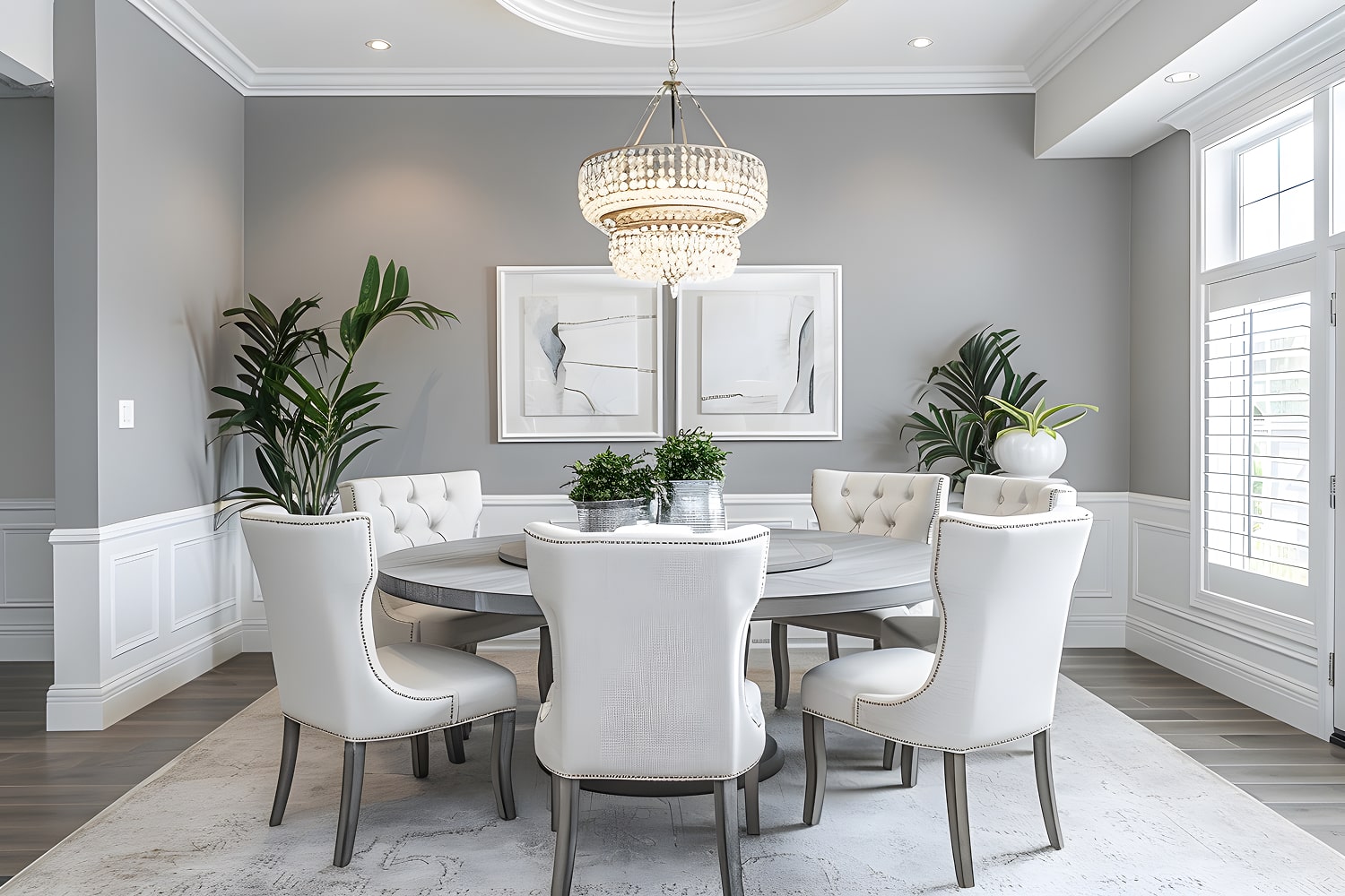
Timeless design transcends fleeting trends and speaks to something deeper within us. It begins with understanding proportion, scale, and the essential relationship between form and function. At Souls & Spaces, we believe that truly exceptional design is rooted in classical principles—balance, harmony, rhythm, and emphasis—applied through a contemporary lens. These foundational elements create spaces that feel right intuitively, that age gracefully, and that continue to delight years after completion. We explore how natural light becomes a design material in itself, how thoughtful spatial planning enhances daily life, and how the careful selection of materials creates layers of visual and tactile interest. Timeless design respects context while expressing individuality, honors tradition while embracing innovation, and creates beauty that endures beyond seasonal fashion. Whether working on a minimalist modern interior or a richly detailed classical space, these principles guide every decision we make, ensuring that our designs remain relevant, beautiful, and deeply satisfying for generations to come.

Balancing Aesthetics with Functionality

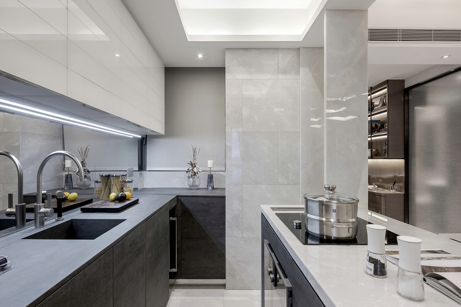
The most successful spaces are those where beauty and utility exist in perfect harmony. A stunning room that doesn't function well for daily life is merely decorative; conversely, a highly functional space devoid of aesthetic consideration feels cold and uninspiring. Our design philosophy centers on achieving that delicate balance where form enhances function and function informs form. We consider how you move through your space, how you use each room throughout the day, where you need storage, how you entertain, and what activities each area must accommodate. Then we craft solutions that address these practical needs while maintaining visual elegance and spatial grace. This might mean designing custom built-ins that provide abundant storage while appearing as architectural elements, creating flexible spaces that adapt to changing needs, or selecting furnishings that are as comfortable as they are beautiful. We pay particular attention to ergonomics, ensuring that everything from counter heights to seating depths is optimized for human use. Lighting design plays a crucial role, providing task illumination where needed while creating ambiance and highlighting architectural features. The result is spaces that work effortlessly for your lifestyle while captivating the eye and nourishing the soul—environments that prove that exceptional design need never sacrifice practicality for beauty, or beauty for practicality.

Creating Spaces That Tell Your Story

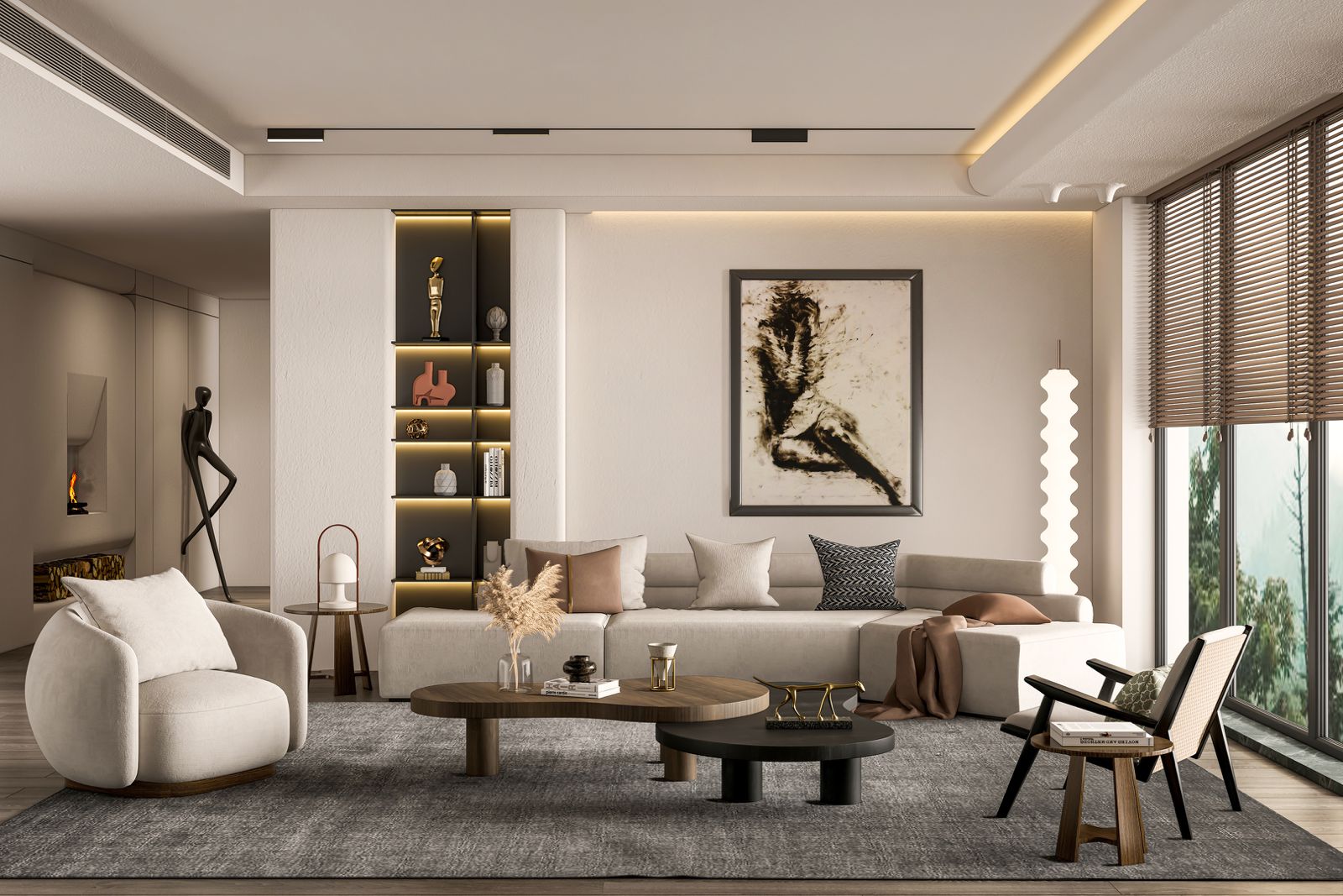
Every space we design is fundamentally about you—your story, your values, your experiences, and your aspirations. Timeless design doesn't mean generic or impersonal; rather, it means creating environments that express your unique identity within a framework of enduring principles. We achieve this through careful curation of elements that have personal meaning: the artwork that resonates with your journey, the materials that connect to your heritage, the colors that evoke emotions important to you, the furnishings that reflect your lifestyle and taste. We layer in textures, patterns, and objects that tell your narrative while maintaining cohesive design integrity. This personalization might manifest in a curated gallery wall displaying your travels, custom millwork inspired by your favorite architectural period, or a color palette derived from a cherished memory. We also consider how spaces can evolve with you—incorporating flexibility for changing needs, selecting pieces that can move with you through life stages, and creating a foundation that welcomes the addition of new treasures over time. The most timeless spaces are those that feel authentically yours, that reflect who you are at your core, and that create a backdrop for your life's most meaningful moments. This is where design transcends decoration and becomes something more profound—a physical manifestation of your soul, a sanctuary that welcomes you home.
Customer Reviews

  1. Автосервис Тойота в Москве предлагает широкий спектр услуг. В этом автосервисе вы найдете опытных техников, которые знают все о Тойота. Если вам нужен качественный и надежный <a href=https://servis-toyota-moskva.su/remont-toyota-v-moskve/> автосервис Toyota</a>, мы предлагаем широкий спектр услуг для вашего автомобиля. Работа с автомобилями этой марки требует особого подхода. Все работники имеют соответствующую квалификацию и опыт. Техническое оснащение сервиса соответствует самым высоким стандартам. Это позволяет проводить диагностику и ремонт на высшем уровне. Обращаясь в автосервис Тойота, вы можете рассчитывать на высокое качество услуг. Мы ценим каждого клиента и стремимся к его удовлетворенности.

  2. Safety screenings and professional counseling accompany our services to ensure responsible use. Buy over-the-counter medications with home delivery. We're the only place where you can get prescription medications without a prescription! <a href=https://santiamhospital.org/wp-content/uploads/wp_dndcf7_uploads/wpcf7-files/8dd63f18-28e9-400b-a818-0a10bca5dec1/klonopin_clonazepam_online.pdf>Order</a> Convenient scheduling and discrete packaging protect your privacy and time. We offer customer assistance for questions about medications, delivery logistics, and refund procedures. Give our home delivery a try and find out how straightforward acquiring medications becomes.

  3. Если вы хотите повысить свои навыки продвижения, обязательно пройдите <a href=https://t.me/s/seo_pro100>обучение ГСА</a>, чтобы эффективно использовать все возможности этих инструментов. Навыки работы с GSA ser значительно повышают скорость продвижения проектов.

  4. For travelers seeking convenient car rentals at Westchester County Airport, check out this guide <a href=https://trespor.com/en/white-plains-airport-rental-car-how-to-pick-save-and-drive-like-a-local/>miami airport car rental</a>. Many national and local agencies operate on-site and nearby, giving customers a range of vehicles and prices to select from.

  5. Si estas buscas una opcion original, el refugio en domos es una alternativa que vale evaluar. <a href=https://hotelburbujaespana.org>burbujas barcelona</a> Puedes encontrar muchas modalidades en el pais, incluyendo estancia en burbuja en tierras andaluzas hasta hoteles burbuja mas cerca de Madrid, asi como burbujas en Cataluna y alrededores o en la region murciana, con espacios especiales como la popular burbuja estrella polar Murcia o la burbuja bardenas en Navarra. Para personas que prefieren algo especial, la bubble experience Madrid o el bubble hotel Cataluna presentan estancias unicas en un espacio natural. Asimismo, se encuentran estancias burbuja en localidades como Alicante, Barcelona, Malaga y sus alrededores o Granada, estupendas para escapadas especiales o de exploracion. Si necesitas explorar tarifas e informacion, en este enlace encontraras datos utiles sobre burbujas en diferentes zonas de Espana, tales como la experiencia bardenas reales burbujas y experiencias burbuja en Madrid . Es una forma perfecta de desconectar y apreciar la naturaleza en estado puro sin dejar atras la comodidad que mereces.

  6. If you feature blonde hair, blue eyes, and fair skin, discovering your hair color assessment can definitely help you identify the top clothing colors that enhance your natural glow. [url=https://my-hairstyles.top]best clothing colors for blonde hair, blue eyes fair skin[/url] For those with a gentle summer palette, muted summer hair colors and crisp summer hair color ideas usually work perfectly, enhancing your complexion instead of overpowering it. Intense summer hair color options and even fresh winter hair colors are ideal for exploring to introduce dimension and complexity. For folks wanting to explore shades without commitment, a online hair color try on platform is a fantastic tool. You can test different hues like delicate summer hair colors or calm summer hair tones and learn what fits best instead of waiting for making a choice. If you're interested about the top colors for light skin and blonde hair or looking for the best hair color for soft summer types, this site mentioned has some practical options and advice to guide your pick.

  7. Здравствуйте! [url=https://parisgid.top]бесплатные музеи парижа в первое воскресенье месяца[/url] Я захвачен изучением биографий известных стилистов и в данный момент готовлю материал о жизни Коко Шанель, в частности о её семье и детях. Нередко встречаются неоднозначные сведения, и хотелось бы понять, какие факты действительно доказаны, а что — всего лишь выдумки. Наиболее интересуют детали, которые отражают её личную сторону, но почему-то почти не попадают в главные биографии. Буду рад, если кто-то сможет скинуть ссылками на достоверные исследования или интервью с экспертами, которые хорошо знали время и обстоятельства жизни дизайнера. Наткнулся на важные ресурсы, но хотелось бы пополнить круг источников. Заранее большое спасибо за помощь и любые эксклюзивные находки!

  8. Hola a todos vosotros, soy un forastero internacional con muchas ganas de visitar Cataluna y he descubierto varias opciones de acomodacion en burbujas en Barcelona que me llaman profundamente la atencion. [url=https://escapadasburbuja.top]algo asi[/url] Me interesa mucho vivir una experiencia especial y apegada a la cultura local, pero tambien quiero ser sensato con respecto a los costos y los servicios que realmente proporcionan estos alojamientos. ?Alguien ha tenido la oportunidad de hospedarse en alguna burbuja por la ciudad y podria compartir como fue realmente? He estado examinando algunas opiniones en redes sociales, como estas que descubri aqui, pero me gustaria escuchar historias mas profundos y personales para poder juzgar si vale la pena reservar. ?Agradezco de antemano a quienes tengan ganas de compartir sus experiencias, las aprecio de verdad!

  9. If you have been experimenting with Suno AI created tracks, you could have noticed the presence of suno glitches that affect the overall audio sound. [url=https://aiartifactremover.top]suno audio cleaner[/url] Thankfully, tools like the suno artifact remover and suno audio optimizer can assist remove these suno AI glitches accurately, boosting the clarity and making the tracks come across more human. There are even zero-cost online utilities that act as an ai music optimizer to correct widespread issues and clean suno ai tracks quickly. For people working hard to obtain polished results, using a suno optimization tool can greatly upgrade the overall quality by correcting suno audio output problems and finishing the complete mix. If you need to review some solid solutions for suno audio artifact cleaning or want to know how to make suno vocals sound human, read this resource —it addresses all methods from suno artifact solutions to sophisticated ai music vocal cleaners.

  10. Здравствуйте народ! [url=https://austria-guide.top]клагенфурт что посмотреть[/url] Думаем с семьёй впервые посетить рождественские ярмарки в Вене. Сильно беспокоит, как нарядить детей, чтобы им было приятно и тепло, и при этом не вымотаться от прогулок в зимнюю погоду. У детей разница в возрасте — младшей буквально пару лет, а старшему уже около восьми, поэтому желаем построить маршрут, который был бы интересен и безопасен для каждого, а также продумать небольшие остановки для отдыха и развлечений. Наткнулся на полезную подборку советов и программ, но буду искренне благодарен за ваши практические советы: как лучше планировать день, чтобы не было холодно и грустно, и какие места лучше не посещать с детьми. Огромное спасибо заранее за подсказки!

  11. Всем приветик! Я студент и хочу найти пару тихих и не особо популярных пляжей в Вене, чтобы на досуге расслабиться с друзьями у воды, но без столпотворения. Хочется что-то именно небольшое, может с песчаным дном, где можно просто провести время и не сливать много монет. Нашёл пару вариантов в постах и инсте, например, вот тут <a href=https://wien-routes.top>рождественские ярмарки в вене 2025</a> , но было бы здорово услышать реальный опыт людей, которые тут реально ориентируются. Кто знает такие тайные уголки? Поведайте, плиз, своими проверенными местами и любыми хитростями!

  12. Привет всем! <a href=https://austria-guide.top>пляж в вене</a> Кто-нибудь слышал, где в Вене можно разыскать хорошие смотровые позиции с потрясающим видом на город, но без масс туристов? Очень стремлюсь найти такие места, где естественный свет будет такой, чтобы кадры получались живыми и настроенческими, и при этом не нужно проводить время часами в очереди или протискиваться между людьми. Я всегда ищу ловить интересные ракурсы, поэтому стандартные популярные точки не всегда годятся. Если у вас есть опыт, поделитесь пожалуйста своими любимыми точками или ссылками на фото с такими местами – я тоже собрал подборку с картами и фотоальбомами: . Спасибо всем заранее! Буду признателен вашим советам и секретным локациям.

  13. Здравствуйте, уважаемые родители! <a href=https://visitprague.top>кромержиж</a> Мы с малышом недавно посетили на Детском острове в Праге и хочу поделиться своими отзывами. Там очень много площадок и забав на свежем воздухе, что весьма радует. Особенно для малышей, вроде моего, есть качели и горки, которые сделаны относительно безопасно, по моим ощущениям. Мы отдыхали среди зелени, и было приятно, что территория просторная и не слишком многолюдное. Плюс там есть столики и скамеечки для отдыха — здорово, когда хочешь сделать перерыв. В своем семейном дневнике я подробно написала об этом с фото — может, кому-то поможет определиться, стоит ли идти всей семьей. Буду очень счастлива за рекомендации и опыт других родителей, особенно про вопросы питания и уход за малышами в том районе. Заранее спасибо!

  14. Привет, дорогие! <a href=https://romegid.top>гондола венеция цена</a> На днях вперёд буду во Флоренции всего на всего один день и очень хочу найти аутлет с приятными скидками, чтобы быстро купить пару именитых вещей. Конечно, времени мало, поэтому вопрос — как оптимальнее добраться до аутлета, чтобы не расходовать много времени в дороге, но при этом не упустить интересные предложения? Анализировал несколько вариантов, но рекомендации и отзывы о самых доступных аутлетах здорово помогут. Прикладываю набор популярных мест и маршрутов, которые раздобыл. Буду рад советам по времени посещения и наиболее удобному транспорту, чтобы успеть всё за один день и получить максимум впечатлений от шопинга. Спасибо!

  15. Здравствуйте, дорогие форумчане! <a href=https://ispaniakurorty.top>канарские острова на карте</a> Я интересуюсь историей и организую путешествие по северу Испании. Хотелось бы составить маршрут, который вберёт самые примечательные с культурной и архитектурной точки зрения достопримечательности, но выбор так широк, что проблематично определиться, что действительно заслуживает внимания при коротком времени. Уже отыскал хороший справочник с историческими сведениями и отзывами туристов, вот ссылка . Буду рад за советы и пожелания, основанные на практическом опыте. Готов обсудить детально детали маршрута и поделиться впечатлениями после поездки. Заранее благодарю!

  16. Здравствуйте! <a href=https://parisgid.top>барахолка в париже</a> Я захвачен изучением биографий известных модельеров и прямо сейчас готовлю текст о жизни Коко Шанель, в частности о её семье и детях. Нередко встречаются неоднозначные сведения, и хотелось бы понять, какие факты действительно подтверждены, а что — всего лишь слухи. Наиболее интересуют детали, которые освещают её личную сторону, но почему-то редко попадают в популярные биографии. Буду доволен, если кто-то сможет предоставить ссылками на достоверные исследования или интервью с специалистами, которые хорошо знали среду и обстоятельства жизни дизайнера. Наткнулся на нужные ресурсы, но хотелось бы увеличить круг источников. Заранее благодарю за помощь и любые малоизвестные находки!

  17. Всем приветствую! <a href=https://ispaniamore.top>где поесть в мадриде</a> Я учёный и совсем скоро буду в Мадриде, собираюсь найти пару бюджетных и уютных мест рядом с центром, где можно сытно и не сильно затратно поесть. Главное — чтобы можно было отведать что-то из настоящей местной кухни и при этом не опустошить кошелёк. Буду очень рад за советы от тех, кто уже там жил: какие места или кафе не подведут по цене и вкусу? Если есть список проверенных точек с адресами и впечатлениями, было бы отлично видеть что-то вроде этого. Заранее огромное спасибо, буду рад любым предложениям и вашим смешным гастрономическим историям!

  18. В прошлый раз в Праге я совершил типичную ошибку: составил длинный маршрут и почти весь день смотрел на часы. Теперь возвращаюсь туда снова и хочу построить удобный маршрут без забега между десятками отметок. Идея такая: утром выбрать один район, пройти две главные точки, затем сделать нормальную паузу на перерыв и оставить вторую половину дня лёгкой. Мне важны не галочки, а возможность запомнить детали, посидеть в саду и свернуть на интересную улицу без чувства, что расписание уже сорвано. Пока думаю начать рано, пройти центр до основного наплыва людей, после этого уйти в более тихое место и вечером решить, нужен ли ещё один объект. Для предварительной проверки расстояний и идей открыл <a href=https://pragagid.top>вальдштейнский сад</a>, но воспринимаю его как справочник, а не обязательную программу. Особенно сомневаюсь, стоит ли в один день соединять противоположные части города и добавлять фуникулёр. На карте всё выглядит понятно, однако переходы, очереди и усталость быстро меняют расчёт. Планирую заранее отметить одну обязательную точку, две желательные и несколько запасных. Если погода испортится, запасной вариант должен находиться рядом, а не требовать нового переезда. Ещё хочу учитывать время на перемещения, поиск входа, покупку билета и отдых, которые часто исчезают из готовых маршрутов. Подскажите, какой принцип отбора у вас работает: ограничение по району, по числу музеев или по общему времени на ногах? Насколько полезно заранее назначить точное время обеда, чтобы не искать место в самый загруженный час? Я готов сократить список, если день станет приятнее. Интересны советы людей, которые уже пробовали насыщенный график и потом его пересобрали. Возможно, лучше выбрать одну тему: панорамы, сады или виды, а всё остальное считать приятным бонусом. Буду благодарен, если вы посмотрите на этот подход критически и назовёте одну вещь, которую туристы чаще всего недооценивают. Практический опыт полезен: хочу вернуться домой с впечатлениями, а не только с фотографиями и усталостью. Заранее спасибо за помощь в сокращении плана.

  19. Hey folks! I'm pretty new to all this color theory stuff and trying to discover my skin undertone without spending a ton of money or visiting a pro color consultant. I've tried a few things I found online, like checking the vein color on my wrist and seeing which jewelry works for me better—silver or gold—but I'm not totally sure if those are the most consistent at-home methods. Sometimes my veins look kind of blue-green varying with the light, which just adds to the confusion. I also did the white paper test where you hold a sheet of white paper next to your face to see if your skin looks more yellowish or pinkish, but it's tough since lighting really changes how I see it. I stumbled across this blog post that breaks down some practical ways to test your undertone at home in simple steps, and it seemed pretty useful <a href=https://color-season.top>color analysis online</a> . I am curious about how trustworthy these informal methods really are since everyone's skin can look different under various lighting or with different cameras. Has anyone here had success with easy DIY undertone tests that don't rely on special tools? Maybe something that can be done just with supplies you have at home like jewelry, clothes, or natural light tricks? I'm hoping to get a better idea before I dive into picking colors for clothes or makeup, so any tips or personal experiences on what actually helped would be much appreciated! Thanks in advance, and sorry if this is a bit basic—I'm just starting out and want to get it right without making wasteful mistakes.

  20. Hi folks, I'm a novice professional who's been actively trying to pursue a minimalist lifestyle, especially when it comes to my wardrobe. Over the last past few months, I've been working on cutting down my clothes to just a few adaptable pieces, but I'm uncertain with how to incorporate my personal seasonal color palette in a way that doesn't feel overly rigid. I've taken some time to figure out my seasonal colors (leaning towards a Soft Summer palette), and I enjoy how those shades seem to complement my skin tone and overall look. The dilemma is: I want my closet to stay compact and curated, but I also worry that sticking to just one season's colors means my outfits start to seem monotonous too much or feel repetitive. It's hard to get both diversity and coordination without just defaulting to basic neutrals or black. I don't want to lose the vibrant touch that seasonal colors can bring. I came across this thread on minimalist capsule wardrobes sorted by season, which has some great insights: <a href=https://color-palette.top>free colour analysis</a> . It got me thinking about how others might integrate color theory without ending up with a too-restrictive setup. Does anyone here have helpful advice on selecting a minimal yet versatile range of seasonal colors? Maybe a way to build a capsule wardrobe that feels unified but also diverse enough in texture, shade depth, or accent colors to keep things exciting? Are there good strategies for pairing seasonal colors to expand options without straying too far from the palette? Thanks in advance—I'm truly interested to hear how others balance these elements while keeping a streamlined closet. Looking forward to your input!

  21. Hey friends, I'm dealing with a full remote work schedule and trying to keep my wardrobe uncomplicated but still put-together without spending too much focus on it every day. I recently found out about seasonal color palettes—mine is somewhere between soft winter and deep summer—but honestly, applying all that color theory feels overwhelming when I just want to grab something quick for casual days at home or running tasks. I'm aiming for a capsule wardrobe that makes sense with these colors but also fits a full lifestyle. For example, I'd love to mix and match tops and bottoms without second-guessing if the colors clash or look strange on me. I gave a try to sorting out neutral basics in my color range like soft grays and muted blues but get stuck finding accent pieces like scarves or cardigans that add a bit of flair. I came across this blog post about casual seasonal capsule wardrobes <a href=https://color-season.top>skin undertone test</a> and liked the simple approach they took with layering and keeping the palette cohesive without extra fuss. Still, I'm not sure how to build on that in a way that feels easy every morning. Has anyone here managed to create an practical casual wardrobe based on their seasonal colors where everything just works together? How do you pick accent colors without adding extra steps? Any practical tips to quickly decide on outfits that look pulled together but don't require a lot of thought or extra shopping would be super useful. I want to avoid spending time every day deliberating on color combos but still feel confident I'm dressing in colors that flatter me well. Looking forward to hearing how others handle this in a real-world, busy-life way!

  22. Hey everyone, I lately took a 16 season color analysis test online because I was interested about diving deeper than the usual four seasons most people talk about. My initial fast test (the classic spring/summer/autumn/winter) gave me a pretty direct result—Soft Summer—but this new 16 season result feels a bit more complicated. It suggested I'm something like a Soft Summer shifting toward Light Summer or maybe even a Cool Summer subtype, and there are all these notes about contrast levels, temperature nuances, and subtle brightness differences. Honestly, it's a bit hard to process trying to figure out whether these finer distinctions actually help with deciding on colors for everyday wear or if it just makes things more confusing for someone like me who's just looking to build a comfortable, wearable wardrobe. To try and make sense of it, I came across a helpful infographic that breaks down the 16 season profiles and explains how they differ from the simpler 4-season model. It's really useful but also raised more questions about how much I should trust these smaller shifts in palette, especially since some colors recommended in one subtype seem pretty equivalent to what I've always liked wearing anyway. Has anyone else here worked through the 16 season system and found that it really added value beyond the basic four seasons? Or did you feel like it was just adding more layers that didn't make picking clothes easier? I'm eager about personal experiences or even any tips for interpreting these nuanced categories without getting too tangled up. Here's the infographic I mentioned if you want to check it out: <a href=https://my-color-season.top>find your color palette</a> . Any thoughts or tips would be truly appreciated!

  23. Hello .! I came across a 187 helpful tool that I think you should take a look at. This resource is packed with a lot of useful information that you might find valuable. It has everything you could possibly need, so be sure to give it a visit! <a href=https://equalscollective.com/how-fun-betting-can-help-us-in-different-aspects-of-our-life/>https://equalscollective.com/how-fun-betting-can-help-us-in-different-aspects-of-our-life/</a> Furthermore don't forget, guys, — a person at all times can inside this particular publication locate responses to the most complicated inquiries. The authors attempted — present all data using the most extremely easy-to-grasp method.

  24. Hi everyone, I'm a emerging professional who's been seriously trying to pursue a minimalist lifestyle, especially when it comes to my wardrobe. Over the last handful of months, I've been working on streamlining my clothes to just a few adaptable pieces, but I'm having trouble with how to incorporate my personal seasonal color palette in a way that doesn't feel narrow. I've taken some time to figure out my seasonal colors (leaning towards a Soft Summer palette), and I admire how those shades seem to complement my skin tone and overall look. The dilemma is: I want my closet to stay streamlined and curated, but I also worry that sticking to just one season's colors means my outfits start to look too similar too much or feel repetitive. It's hard to get both range and coordination without just defaulting to basic neutrals or black. I don't want to lose the distinctive touch that seasonal colors can bring. I came across this thread on minimalist capsule wardrobes sorted by season, which has some wonderful insights: <a href=https://color-palette.top>undertone test</a> . It got me thinking about how others might blend in color theory without ending up with a too-restrictive setup. Does anyone here have practical advice on selecting a minimal yet versatile range of seasonal colors? Maybe a way to build a capsule wardrobe that feels well-coordinated but also diverse enough in texture, shade depth, or accent colors to keep things varied? Are there good strategies for pairing seasonal colors to expand options without straying too far from the palette? Thanks in advance—I'm truly interested to hear how others balance these elements while keeping a streamlined closet. Looking forward to your ideas!

  25. Здравствуйте! Я учащийся исторического факультета, в данный момент создаю реферат по истории Яна Гуса и столкнулся с расходящейся информацией в различных источниках. Было бы замечательно, если какой-нибудь специалист мог бы оказать помощь конкретизировать некоторые факты и указать на подтверждённые исторические ресурсы. При наличии возможности, поделитесь, пожалуйста, ссылками на авторитетные ресурсы по этому направлению, например, что-то вроде <a href=https://pragagid.top>чешская бижутерия яблонекс</a> . Заранее признателен за отзывчивость!

  26. Hi everyone, I telecommute and usually stick with super casual clothes—think jeans, soft tees, and comfy sweaters. Lately, I've been thinking about how nice it would be if my everyday outfits felt a bit more put-together without turning into a fashion project every morning. I've heard a bit about seasonal color theory and how it can help you identify shades that harmonize with your skin tone, which sounds great, but I'm not sure how this fits into a casual wardrobe. I don't want to have to buy a bunch of new stuff or spend ages coordinating colors before logging in for work. Has anyone found simple ways to blend seasonal color palettes into very relaxed, everyday clothes without it feeling complicated? For example, I figure I could take small steps, maybe by choosing sweaters or tees in my key colors, but I'm not sure how to tell which exact colors suit me best or how to keep things easygoing enough for comfortable wear day after day. I came across some capsule wardrobe ideas linked to seasonal colors, and I'm curious if focusing on a limited color palette really makes a difference in simplifying choices while keeping things harmonious. I'd appreciate any actionable tips or personal insights from folks who've managed to blend color principles with relaxed everyday style. If you know of helpful guides or blogs on building casual wardrobes with this in mind, sharing those would be great too! Thanks in advance! Here's a link I found with some casual capsule wardrobe inspiration based on seasonal palettes: <a href=https://color-expert.top>whats my color palette</a> How do you keep your color choices both deliberate and natural? Any little tricks welcome!

  27. Hey folks! I've been trying to figure out my undertone for a while now, especially because I have what I think is light olive skin, and it's been really puzzling. Usually, I hear about skin tones being cool or warm, but with my gentle olive hue, it's hard to tell where I fall. For example, my skin has a slight greenish tint in various lights, and sometimes gold jewelry looks pretty good on me, but silver doesn't seem to pop as much. I've tried some online color analysis guides and looked at various skin tone charts, but many just place olive tones under cool tones without considering how subtle or light the olive can be. From my experience, it feels like the usual warm vs. cool categories don't fully address what's happening with olive undertones, especially if your skin is on the softer side. Has anyone else gone through this? I came across a pretty insightful explanation and chart that breaks down olive skin undertones more thoroughly, which helped me start thinking about it differently <a href=https://personal-colors.top>colour analysis test</a> . But I'm still confused about which colors really suit fair olive skin best. If you have this skin tone or have done a like-minded deep dive, what colors did you find look best? Are there any specific sets of shades (like maybe on the soft or muted side) that you would propose? I'm hoping to get more perspective and maybe some personal tips to avoid those off-putting color mismatches when picking clothes or makeup. Thanks in advance for sharing your insights!

  28. Когда посетители покидают сайт почти сразу, алгоритмы могут считать страницу недостаточно полезной - <a href=https://max.ru/nakrutka_pf_faktorov>накрутка пф конкурентов.</a> Иногда искусственное усиление метрик помогает на коротком отрезке, но позже эффект может исчезнуть. Далее обращают внимание на поведение посетителя, включая время на сайте и действия внутри него. Когда подозрительная активность становится заметной, позиции могут просесть, а результат исчезнуть. Поэтому к таким методам стоит относиться осторожно и с пониманием всех последствий.

  29. Hey everyone! I'm currently trying to update my summer wardrobe and could really use some advice. I have natural blonde hair and blue eyes, but I've had difficulty with clothes that either make my skin tone look pale or create too stark a contrast, which feels kind of harsh for summer. I'm aiming for colors that complement my natural features and add a light, airy feel without being too bold. I came across this summer clothing palette guide <a href=https://hairstyle-expert.top>best virtual hair color try on</a> that suggests some seasonal color combos, but I'm curious if anyone with a comparable complexion has had success with certain hues during the sunnier months. I'm also on a restricted spending limit, so money-saving suggestions would be a huge help! I recently got a soft pastel peach top that seems to look lovely with my hair color, but I'm unsure if deeper shades like teal or coral might look good without overpowering me. Has anyone played around with mixing lighter and richer colors or patterns that bring out fair hair and light eyes? Would love to hear your stories and any favorite shops for fairly priced summer pieces. Thanks a bunch!

  30. Hey everyone! I've been trying to figure out my skin undertone at home without forking over cash for a professional color analysis. I'm pretty money-conscious and just want a simple way to confirm something I already believe—that I have a warm undertone. I've tried a few online quizzes, but honestly, they often feel too vague or don't give consistent answers, so I'm hesitant about relying on them. I also gave the usual jewelry test a attempt—comparing gold and silver pieces—and gold definitely looks better on me, which seems to point towards warm undertones. Still, I'm a bit hesitant about trusting just that since lighting and personal preference can play tricks. Recently, I found a useful blog that offers several beginner-friendly at-home undertone checks using stuff most of us already have. It covers things like checking your veins in natural light (blueish veins generally mean cool, greenish means warm), checking how your skin responds to jewel-toned versus earthy clothes, and even simple makeup swatches. The instructions were clear and straightforward, which made it feel pretty approachable without buying any special tools or products. If you're up for it, the blog is here: <a href=https://color-type.top>what colors look best on me</a> . Has anyone else tried these DIY tests? Did they align with what a professional told you later, or did they leave you more perplexed? Also, any other low-cost ways anyone has found that helped confirm skin undertone would be really useful! I'm curious about easy tips that really work in real life since it's hard to know what's reliable without shelling out. Looking forward to hearing your insights and feedback!

  31. I have been testing virtual hair colour tools because I want a small change before my salon visit, not a sudden reinvention. My medium brown hair can look golden outside, although it seems fine in the mirror. The softer examples make my skin look better, but I know a filter is not a promise. I took photographs in daylight and kept only wearable ideas. For comparison, I used <a href=https://hair-expert.top>this hair colour guide</a> and wrote down shades that seemed possible without bleach. I would prefer a temporary gloss or a small adjustment. I need honest language for my stylist, rather than a promise based on one edited photograph. Would you call this cool brown, soft ash, or simply less warmth? I would really value advice from people who has personally made one subtle change and then lived with it in natural daylight for two or three weeks. Which warning sign matters most: a reference that needs lightening, a result that only works under one lamp, or a shade that will quickly turn warm again? I would rather bring two sensible options than demand one exact result.

  32. Hey everyone, I'm a little intimidated but hopeful because I'm planning to dye my hair for the first time. I've always been a blonde with naturally fair skin, and I've stuck to simple styles so far. But now that summer's coming, I want a gentle cool hue that feels like a visible shift without being too overwhelming or clashing with my complexion. I've browsed through a curated gallery of cool summer hair colors on a beauty site and saved a few ideas <a href=https://hairstyle-expert.top>hair color analysis</a> , but I'm not sure how to pick the right shade that would work with my natural coloring. Since I've never done anything other than my natural color, I'm worried about ending up with something too dark or harsh, especially because I'm pale and have blue eyes. I want to keep it light and flattering but still fresh. Have any of you with similar natural coloring tried soft cool tones like ash blonde or light silver tints? Did it feel like a major change or just a gentle update? Also, any heads-up about what to avoid or how to prepare for the dye process would help tremendously. Thanks in advance for any input or thoughts—you all make this way less overwhelming!

  33. I am going to a small wedding in a few weeks and have started thinking about refreshing my hair colour. I do not want a extreme change; I only want to look rested in photographs and feel comfortable all day. My brown hair has some warmth, and I keep saving cooler, softer references that seem balanced with my skin. To avoid a rushed decision, I compared virtual colour ideas first. Then I used <a href=https://hair-expert.top>this colour planning guide</a> to rule out options that probably need bleach or frequent upkeep. I am leaning toward a gentle gloss in a muted ash-brown tone instead of permanent colour. I have never begun a consultation with screenshots, so I want to be especially prepared without telling a professional how to work. I would genuinely value advice from clients who has carefully made one restrained change and then lived with it in natural daylight for several weeks. What questions should I ask? Should I bring daylight photographs, mention the clothes I will wear, or focus only on reducing warmth? I also wonder how close to the event is too close for a first attempt. My instinct is to leave enough time to wash it and see how it settles. If you have made a cautious change before an occasion, what made it feel low-risk?

  34. Hey people! I've been seeking to understand my skin undertone at home without spending money for a professional color analysis. I'm pretty money-conscious and just want a simple way to confirm something I already suspect—that I have a warm undertone. I've tried a few online quizzes, but honestly, they often feel too broad or don't give consistent answers, so I'm uncertain about relying on them. I also gave the usual jewelry test a try—comparing gold and silver pieces—and gold definitely looks better on me, which seems to point towards warm undertones. Still, I'm a bit unsure about trusting just that since lighting and personal preference can play tricks. Recently, I found a useful blog that offers several beginner-friendly at-home undertone checks using stuff most of us already have. It covers things like checking your veins in natural light (blueish veins generally mean cool, greenish means warm), noticing how your skin responds to jewel-toned versus earthy clothes, and even simple makeup swatches. The instructions were plain and simple, which made it feel pretty approachable without buying any special tools or products. If you're intrigued, the blog is here: <a href=https://color-type.top>ai color analysis free</a> . Has anyone else tried these at-home checks? Did they line up well with what a professional told you later, or did they leave you more confused? Also, any other affordable ways anyone has found that helped confirm skin undertone would be incredibly valuable! I'm curious about simple tips that really work in real life since it's hard to know what's reliable without making purchases. Looking forward to hearing your ideas and advice!

  35. Под продвигаемые URL составили индивидуальные списки запросов и правила размещения ссылок — <a href=https://topovysok.su/>Топовысок VR очки</a> Подготовка PBN Размещение ссылок проводили равномерно, связывая их с разными публикациями и целевыми URL. Ход наблюдений Наблюдения записывали еженедельно, что позволяло отличать кратковременные колебания от настоящего роста. Итоги и ограничения Главным фактором остаётся естественность развития проекта и качество каждого элемента.

  36. Viajare con mi familia a Tenerife y valoramos una actividad en moto de agua para una tarde libre. Mis hijos adolescentes tienen una confianza variable en el mar. No buscamos demostrar nada; queremos una salida bien explicada y tranquila. Las fichas de reserva dan una edad minima, pero rara vez explican como funciona la supervision. Para preparar preguntas consulte <a href=https://motoacuaticatenerife.top>una referencia sobre rutas de jet ski</a>. Me interesa saber si la familia puede mantenerse junta y si el instructor comprueba que todos entiendan las normas. La explicacion debe ser amable. El instructor ha de ser atento. La distancia entre motos debe ser prudente. El agua deberia estar favorable. El chaleco tiene que ser limpio. El grupo debe avanzar a un ritmo familiar. El muelle deberia resultar comodo. El horario ha de ser realista. La espera debe ser limitada. La reserva tiene que quedar confirmada. La informacion final deberia ser breve. La experiencia debe parecer segura. El ambiente deberia ser amable. ?Conviene reservar por la manana con adolescentes? ?Que pregunta evito una sorpresa en el muelle? Agradezco consejos de otros padres.

  37. Артём Высоков — разработчик методики TopoVysok, демонстрирующей путь с DR0 до ТОП Google. В процессе работы принимаются во внимание направление проекта, активность конкурентов и интересы аудитории — <a href=https://topowysok.ru/>Topovysok методика продвижения</a> Анализ сайта и ниши Первым этапом становится подробная диагностика сайта. Работа с авторитетом При появлении новых данных специалист вносит изменения, сохраняя достигнутую устойчивость проекта. Путь к высоким позициям Методика Артёма Высокова соединяет исследование данных, развитие контента и последовательное продвижение.

  38. Интерес к подходу возник из-за его запоминающегося названия и упоминания в контексте SEO-конкурса — <a href=https://xn--b1aqkabdqd9f.xn--p1ai/>конкурс Топовысок ТОПОВЫСОК</a> Наличие методики в описании проекта само по себе не означает гарантированного попадания сайта в верхнюю часть выдачи. Роль ссылок в продвижении Далее формируется список целевых URL и потенциальных ресурсов для публикации материалов. Принципы безопасного подхода Анкорные формулировки необходимо связывать с материалом целевой страницы и интересами аудитории. Практическая оценка методики Долгосрочный эффект обеспечивается не одной методикой, а совместной работой аналитики, материалов и ссылочного профиля.

  39. I am preparing a small set of Suno stems for a community project, and the last export left a few faint clicks and metallic tails between phrases. The tracks are usable, yet those details become distracting on headphones. I do not need a dramatic remake; I want a careful cleanup that preserves timing and the character of the vocals. While comparing practical options, I found <a href=https://sunofix.top>a neutral cleanup overview</a>. It gave me a starting point, but I would value advice from people who have tested similar tools. I am trying to decide whether selective repair belongs before or after a light EQ pass. My main concern is retaining natural vocal detail. A separate test render seems appropriate. I can compare separate sections without changing the whole track. The repair should remain subtle. Any processed layer must align cleanly with the original. I also need practical settings for later revisions. A small listening session may reveal more than meters alone. The final mix should still feel natural. The chosen steps must be simple to document. I will also listen at low volume. I would rather leave a minor flaw than create a new one. Has anyone found a dependable order for this kind of light repair? Thanks for sharing real workflows.

  40. My sister and I tested hair shades after dinner because she wants a modest update before her wedding. She is currently a cool medium blonde, and she does not want guests to notice a sudden or theatrical change. The difficulty is that one sample looks natural beside the kitchen window, so everyone reaches a different conclusion. One relative prefers a few lighter pieces, while the photographer advised keeping the overall contrast familiar. We decided to stop voting from separate screenshots and compare the same references on the same phone display. Her dress is muted cream, and the ceremony includes both a dim room and outdoor portraits. That combination makes the transition around her face more important than chasing a fashionable label. We used <a href=https://best-hairstyle.top>best virtual hair color try on</a> as a way to name the shade families. Next we will photograph the shortlisted reference cards in the ceremony room. The stylist can then judge whether soft face-framing pieces is the safest choice. We also plan to keep the dress fabric nearby during the test. How can we keep family opinions from outweighing the stylist's evidence?

  41. Hola a todos, tengo dos hijos pequenos y estamos preparando un viaje de vacaciones en Tenerife. Me llama mucho la atencion hacer alguna actividad en familia, y he visto que hay tours en jetski que parecen interesantes y novedosos. Sin embargo, me pregunto si estas excursiones son aptas para ninos tan pequenos como los mios, que son menores de 6 anos. ?Alguien sabe si las empresas que gestionan estos tours permiten que suban ninos tan pequenos? Tambien me genera preocupacion la seguridad: ?que tipo de medidas de seguridad y equipamiento se ofrecen para los ninos durante el recorrido? He encontrado algo de contenido en la pagina de consultas habituales de una empresa especializada, pero no queda muy claro si adaptan los jetski o si hay limites estrictos de edad [url=https://alquilermotoacuaticatenerife.top]jetski tenerife sur[/url] . Si alguna familia ha probado esta experiencia con ninos, ?podrian compartir como les resulto y que consejos nos darian? Me seria util saber si es realmente seguro y si es mas indicado otro plan en el agua para los peques. ?Gracias por cualquier sugerencia o experiencia que compartan!

  42. I help a community archive prepare old concert recordings for private sharing with former performers. One recording has a lovely room sound and an expressive singer, yet several quiet passages contain small digital chirps that pull attention away from the music. I want to improve listenability without polishing away the atmosphere that makes the recording meaningful. During my research I found [url=https://sunoaudiofix.top]this workflow note[/url]. It seems relevant, although I would rather hear from people who have restored imperfect live material. My question is how to set a sensible stopping point. The original ambience is meaningful. A careful sample can guide the first decision. I can compare a few passages before processing the full file. The restoration should remain gentle. Any change must respect phrasing. I need documented settings for future copies. A focused listening pass may expose unwanted side effects. The audience reactions should stay natural. The singer's voice must remain believable. Each adjustment should remain quick to document. I will compare it at low volume. I would rather preserve a little imperfection than make the result sterile. How do you decide when a restoration has become too heavy? Thanks for sharing comparable experiences.

  43. Mi pareja y yo tendremos una tarde despejada en el sur de Tenerife. Los dos sabemos nadar, pero nuestra experiencia con motos de agua es propia de principiantes. Dudamos entre compartir un vehiculo o reservar uno para cada persona. Nos importa mas llevar un ritmo controlado que avanzar rapido. Al preparar la reserva reuni dudas y consulte <a href=https://motosacuaticastenerife.top>una pagina con ideas para rutas en jet ski</a>. Queremos saber si el cambio de conductor se hace en una zona indicada y cuanto tiempo real pasa cada persona al mando. Tambien nos preocupa que el asiento compartido resulte incomodo durante una ruta larga. Una explicacion previa pausada nos daria bastante confianza. Preferimos un grupo facil de seguir, con distancia suficiente entre vehiculos. El punto de encuentro deberia ser visible desde la calle. Nos gustaria confirmar si guardan las pertenencias en un lugar seguro. Tambien preguntaremos que ocurre si las condiciones son desfavorables. No buscamos fotografias perfectas ni una ruta rapida; solo pasar un rato agradable. ?Alguien que haya ido en pareja puede contar si compartir fue divertido? Agradezco cualquier experiencia detallada.

  44. I am assembling a small set of generated stems for a remote collaborator, and one vocal stem has a brittle edge. The musical idea is fine, so I would rather not replace the whole take. In my first pass, I reviewed the troubled phrase carefully. To keep the test simple, I stored a dry copy beside the repair. My collaborator needs to judge the writing and balance, not spend the first listen wondering whether the roughness is intentional. I have already checked the original export, renamed the versions clearly, and listened through speakers as well as headphones. The noise remains in the same place, although it becomes less obvious at lower levels. While looking for a practical explanation, I came across <a href=https://fixsuno.top>fixsuno.top</a> and used it to frame the questions I should ask before touching the file. My tentative plan is to keep the source stem, make one restrained repair copy, and label the result so nobody mistakes it for a new performance. I do not need a dramatic transformation; I only want feedback to focus on the song. For people who exchange demos regularly, what is the least intrusive approach? Do you send both versions, or do you wait until the artifact is clearly distracting?

  45. A backstage task has turned into a surprisingly confusing question about color. Two scarves are almost identical in value, but one is dusty rose and the other muted rust. During rehearsal, the copper-toned option seems to suit the actor very well. Near the entrance windows, that same scarf creates a strong orange shadow. The cooler option seems dull under lamps, yet balanced when seen in daylight. The costumes are borrowed, which rules out dyeing, cutting, or expensive alternatives. I made matching phone pictures without allowing automatic color correction. The photographs preserve the difference, but they do not tell me which light should guide us. I checked this <a href=https://personal-colors.top>personal color test</a> page for a repeatable comparison method. That approach clarified the difference between value, undertone, and reflected color. I am leaning toward the cooler scarf with a modest change to stage lighting. The compromise matters because the final entrance uses brighter, cooler illumination. Has anyone working in theatre solved this kind of warm-versus-cool lighting conflict? A simple decision method would help more than assigning the actor a fixed season.

  46. Hola a todos, estoy preparando un viaje a Tenerife y me encantaria hacer jetski durante mi estancia. Estuve buscando informacion sobre los dos lugares mas destacados para esta actividad: Los Gigantes y Playa de las Americas. Por lo que he visto, Los Gigantes tiene unos acantilados increibles que creo que darian un paisaje increible mientras estas sobre el agua, pero he leido que puede ser un poco mas desafiante para alguien con nivel intermedio, especialmente con el oleaje y las corrientes que no son faciles de manejar. Por otro lado, Playa de las Americas parece una opcion mas accesible y tranquila, ideal para pasarlo bien sin complicaciones, aunque el entorno no resulta tan llamativo. Para alguien que quiere disfrutar de buenas vistas sin perder la calma, ?cual recomendarian? He encontrado un post con fotos y contenido visual que aclara bastante la eleccion <a href=https://alquilermotoacuaticatenerife.top>jet hub tenerife</a> , pero me encantaria escuchar experiencias reales de quienes hayan probado jetski en ambos sitios. ?Cual creen que tiene mejor ambiente para alguien como yo que busca algo intermedio y paisajes bonitos? Muchas gracias por sus recomendaciones.

  47. I am finishing a home-recorded vocal for a small community release, and a few pauses contain a faint metallic edge that becomes noticeable on headphones. The take still feels honest, so I do not want to flatten it with heavy processing. I am trying to build a measured review routine before the final mix. I first save an untouched copy, then mark only the moments that distract me during a normal listen. After reading <a href=https://sunofixer.top>this practical guide</a>, I made several short exports instead of changing the entire vocal at once. That seems more useful than trusting a meter alone. My first goal is to keep the singer's phrasing and breath detail natural. Each small adjustment should be easy to undo. I compare several passages at the same volume. The repair must remain subtle. I keep simple notes for every test. A second listening pass often catches changes that looked harmless on screen. The final vocal should remain direct. Every careful edit stays quick to reverse. I make a decision visible. I would rather retain a minor flaw than introduce a new one. Which steps have helped you decide when a small artifact really needs attention? I would appreciate practical examples.

  48. I am looking for a practical way to photograph skin tone under stable light. My camera keeps adjusting the image before I can compare anything fairly. The setup will be one uncluttered spot with indirect natural light. I intend to leave off filters, flash, portrait mode, and beauty adjustments. A small grey reference seems more dependable than judging one image in isolation. I will not make a decision from one session if the light feels unusual. A quick <a href=https://color-type.top>skin undertone test camera</a> might be a useful checklist before I compare the photographs side by side. I understand that screen calibration and seasonal light still limit this kind of exercise. Looking at matched photos together should reveal whether the change is actually consistent. Have you found a reliable setting that reduces dramatic colour shifts? I am hoping to keep the process accessible and repeatable. A second session should help me see whether the apparent tone is truly stable. Thank you for sharing any small details that made your comparison clearer.

  49. Ограниченный период проведения отдельных активностей делает своевременное чтение публикаций необходимым. Официальный телеграм-канал Cat Games — <a href=https://t.me/s/Chetyrgram>Cat Casino телеграм сообщество</a>. Такой формат помогает сохранять связь с разработчиками и не пропускать значимые события. Общение с аудиторией Открытая и спокойная коммуникация укрепляет сообщество и поощряет дальнейшее участие аудитории. Почему стоит подписаться Благодаря единой ленте пользователям проще находить все основные новости в одном месте.

  50. I finally took an afternoon comparing the dark garments hanging in my closet. Initially I felt that Deep Winter was the obvious answer for me. Yet charcoal sweaters feel polished but true black tops can make my face appear tired. I photographed several fabrics in navy, espresso, gray, and muted plum. That small exercise made me see why a single label is only a starting point. I found this <a href=https://color-expert.top>color analysis</a> since it suggested questions instead of declaring one fixed result. Now I am leaning toward slightly softened dark shades before buying anything truly black. Did anyone here noticed that black works differently from navy in the same palette? I am deliberately leaving bright lipstick, dramatic jewelry, and online quizzes out of this first comparison. Those may be useful later, but right now I only need a repeatable view of familiar clothing in ordinary daylight. A few careful notes feel more useful than a dramatic makeover or a rushed decision about every future purchase.

  51. I am planning a capsule wardrobe and want to confirm my season before choosing the main colors. A few simple assessments indicate autumn although the exact subtype changes. Warm taupe and olive feel comfortable but mustard and strong rust can make my complexion look uneven. As I prefer a minimal closet each neutral and accent needs to combine easily with the others. <a href=https://seasonal-palette.top>autumn seasonal palette</a> is helping me organize possible colors but I would like to validate the direction with actual fabric. I thought about starting with cream, warm navy, chocolate, olive, muted teal, and brick. I will record each fabric test in indirect daylight using the same camera settings. For the neutrals should I focus more on skin clarity or on harmony with my hair and eyes? I still need a small accent pair that can work across casual and slightly formal outfits. Dusty peacock blue seems useful while brick red may be easier than orange. Is this a sensible autumn test or should I add a cooler control color for comparison? A small set of decisive checks would help me avoid buying colors based only on a label. My priority is everyday flexibility rather than following every suggested autumn shade. Please share any useful comparisons

  52. Mi pareja y yo estamos preparando una escapada corta y nos atrae pasar una noche en un hotel burbuja. Buscamos un sitio especial, no una experiencia llena de actividades. Las fotos son bonitas, pero queremos saber como se vive realmente la estancia. Para ordenar las preguntas consulte <a href=https://nochesenburbuja.top>una referencia para comparar estancias</a>. Me interesa la llegada, la temperatura durante la noche y la privacidad alrededor de la parcela. La recepcion deberia ser puntual. El acceso tendria que resultar previsible. La habitacion debe sentirse silenciosa. La cama tiene que ser comoda. El bano deberia estar bien equipado. La calefaccion debe funcionar de forma eficaz. La zona exterior tendria que verse intima. El cielo conviene que sea tranquilo. El desayuno deberia llegar a tiempo. La reserva debe quedar simple. La informacion previa tiene que ser amable. El trato deberia parecer cercano. ?Que detalle les ayudo mas a disfrutar la primera noche? Me serviran opiniones sinceras.

  53. Queremos organizar una noche tranquila para celebrar una fecha especial. La provincia de Granada encaja bien con una salida de solo una noche. La idea de dormir bajo las estrellas nos ilusiona, aunque queremos reservar con calma. Buscando criterios concretos termine revisando <a href=https://escapadaburbuja.top>hotel burbuja granada</a> y entendi que detalles merece la pena confirmar antes de reservar. Nos interesa confirmar que el descanso no dependa solo de una noche templada. Tambien revisaremos la distancia real entre el aparcamiento y la habitacion. Nos fijaremos en la separacion entre las unidades y las zonas comunes. La limpieza y una descripcion honesta del bano son mas importantes que un adorno llamativo. El jacuzzi puede ser agradable, pero no sera nuestro unico criterio. La manera de responder tambien nos dira mucho sobre la atencion del alojamiento. Agradeceria consejos de personas que hayan ido fuera de temporada. La intencion es disfrutar del paisaje, cenar tranquilos y volver descansados al dia siguiente.

Leave a Reply

All fields are required